
Questions and Responses
1) What are some of the data skills you’d like to develop?
I would like to learn how to see and find if there’s a missing or anomaly in the data. Also, which data is important to use for which type of graph/chart.
2) What excites you/scares you the most about data questioning and exploration?
I’m excited to see the beautiful visualisation on charts and graphs. But I’m also scared to missing something important because I didn’t explore the data correctly.
3) Have a look at the plots and the meta data. What are they communicating? Who is the intended audience? Are the data views clear?
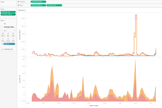
They are communicating the AQI level of PM2.5, PM10 and O3, CO and NOs.
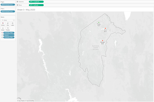
The intended audiences are the Canberrans particularly who live around Monash, Florey and Civic area.
The data views are not clear to me because I can’t see the comparison between all of those numbers just from the meta data.
4) Johan mentioned that a good first step after importing data is to look and see if there are data points you might expect to see. How might you find out what a data set ‘should’ contain?
Check if the data have the right attributes/type (string, boolean, date, time, geographic role, etc) and the right format for date and time.
5) What kinds of data formats appear to be appropriate and valuable here? Do you agree?
The right type/classification for the labels.
Yes, I agree if we can sort them in order and make sense.
6) what is the value of mapping and graphing data? What types of patterns did we identify in the data? Which visualisation did you find to be most effective and why?
The value of mapping and graphing data is better visualisation for better understanding.
We identified the cyclical/repeated pattern in the data.
The step line chart is most effective compare to the circle or line. I tried the area chart as an alternative and also filter the null values to see the difference.
7) what happened in 2014 that caused such a spike in CO?
There was a spike in CO especially in Florey and Monash because of emissions from wood heaters.
Try removing the zero values registered for Civic and see how that changes the average values. See if you can find other interesting patterns in the other measures of the data, and share screenshots of plots.
Mapping data by location
8) What responsibilities are involved in data management? Does it matter who or what (data scientists, practitioners, algorithms, etc.) transforms the data?
Data management responsibilities involved end-to-end process from collecting, transforming, using and storing the data.
Who or what transform the data do matter for some potential bias and blind spots.
Reflections
- How are you transforming the data?
I will ask the reason, purpose and first to understand what I should do with the data. I then will look at the meta data first and see what’s listed on the tables. Check if there’s anything that looks unusual/anomaly and check if the data has the right attributes/type to make it easier for clarification, order and group, etc (Data Cleaning/Wrangling).
- How might others have transformed the data?
Might be different depends on the approach, reason, style and purpose, etc.
- How inscrutable is the data you are working with? (That means how easy is it to understand where it comes from, and whether or not the data has been transformed before)
I think the data is easy to understand in general, but it hasn’t been transformed before (raw data) so it’s a bit messy and need some clean-up first to make sense when we want to transform and visualise it.
- How reliable are your findings/transformations?
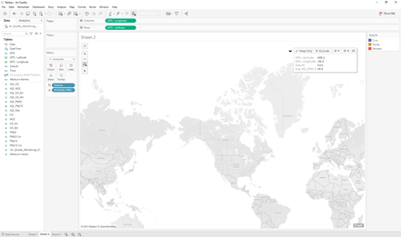
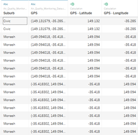
I think it’s not that reliable because there are some missing data (a lot of null) also wrong geo location (longitude and latitude in the reverse order) for almost 3000 rows. So, these locations are on the other side of the world (not Australia).
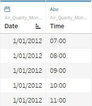
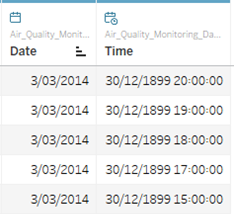
Another strange finding is when the time format in string (abc), the time is displayed in HH:MM and the earliest date starts from 1/1/2012. But when the time format is in date time, the time displayed in DD/MM/YYYY (with the year of 1899!!) and the earliest date is on 3/03/2014.
Develop a list of good practices for the management and annotation of data in the context of the activities we’ve done today.
- Understand the goal/purpose/intention for the data visualisation that we’re about to do. Understand who are the intended audiences and what message are we trying to say with our visualisation.
- Have a look at the metadata, rename if required to make sense and easy to understand.
- Check if there’s any missing data or something unusual/anomaly.
- Change the format of the data if required so we can analyse it better
- Play with different type of view/visualisation to identify any pattern that we can see from the visualisation.
- Set the right metrics. Do not measure everything.
- If you exclude anything, provide the reason or justification for it.